Primary mark for the app, browser icons, and compact placements.
Blueprint / Brand guidelines / v1.0.0
Clanker Docs.
Brand guidelines.
The Clanker Docs identity. Our logos, colors, typography, and the rules for bringing them together.
01 / Outline
01
A document with a face.
Solid and Outline lead the identity. Blueprint brings the same geometry into the full brand palette.
Primary line mark for headers, lockups, and open compositions.

Core color logo with the Blueprint palette and grid.
Clanker Docs
Clanker Docs
02
Three materials. One character.
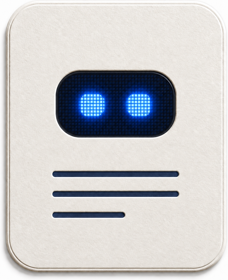
Paper, Glass, and LCD share the winning blue-pixel screen. Use these as illustrations at 128px and above, where the material detail can be seen.








03
A little more expression.
Pill, Round, and Squint are supporting faces. Use the main Soft Corners face for the persistent app identity.


04
The logo at icon size.
Actual CSS pixel sizes, with the full artwork and its clear space. Favor Solid at 16px. Scale every part of the mark together.
On Paper
On Ink
Blueprint
Keep the geometry.Use the supplied artwork. The visor, eyes, and text lines stay in proportion.
Give it room.Keep the 64-unit canvas and at least 8 additional units of space around it, except in the supplied lockup.
Choose clear contrast.Use Ink or Cobalt on light surfaces and Paper on dark surfaces. Material renders retain their original colors.
05
The Blueprint palette.
A precise palette for expressive documents. Cobalt carries the identity; quiet surfaces give the content space.
#2455E8
Cobalt
Brand, primary actions, links
#16233F
Ink
Headlines and primary text
#FFFFFF
Paper
Documents and working surfaces
#EEF3FF
Mist
Quiet backgrounds and selected surfaces
#CBD6EF
Rule
Dividers and decorative grids
#7F65D6
Iris
Secondary diagram emphasis
Product components use semantic theme tokens. Dark mode uses deep Ink surfaces and a lighter blue for actions. Inputs have stronger boundaries than decorative rules; state colors always have a label or icon.
06
Inter. Clear at every scale.
One family connects the website, product, and documents. Semibold headings, Medium labels, Regular body text. System monospace for code and technical identifiers.
Beautiful documents. Created by your agent.
Give your coding agent tools to explain systems with clear writing and rich diagrams. Review the document, leave comments, and have your agent make the changes.
POST /api/documents
07
Show what the product can do.
Use real structure: architecture, sequences, schemas, wireframes, code. Let the quality of the explanation make the case.
How a request gets processed
The API accepts the request. A worker processes it in the background and stores the result.
Show the retry path.
Comment on this diagram
CompositionAlign edges. Keep reading surfaces clear. Use grids around diagrams and brand illustrations.
LanguageName the capability and explain the benefit. Agents create. Developers review, comment, and direct revisions.
MotionUse 120–200ms for controls and 300–600ms per explanatory step. Honor reduced motion and keep a readable static state.
Everything in one kit.
12 masters, color exports, lockups, app icons, social preview, font, and usage guide.
Ready to share.
The homepage preview pairs our message with the Solid logo and Blueprint grid. Use the 1200 × 630 PNG for social previews or the SVG for larger placements.